This project was quite unique, and at first it worried me a lot.
We had very little time and a lot of issues to address.
Subject:
A system for optimizing travel time and routes mainly for heavy-duty transport. The app had been on the market for quite some time and had a loyal customer base—mainly medium-sized businesses. However, our company wanted to bring it to a broader market, so it had to be attractive, easy to use, and compliant with the EAA—the European Accessibility Act. My task was to help with that.
Starting point
The entire application was recently rewritten in Vue. However, the user interface had not been refined. Every button and every form looked almost exactly the same as they did many years ago, when the application was first launched. The problem was that it did not meet EAA standards and was simply difficult to use. The brilliance of the engine on which it was based had no chance to shine.
The original plan was to address the main issues related to the user interface and user experience, since we only had one month to work with. However, as the backlog kept growing, we realized we wouldn’t be able to pull it off. Fixing all the issues would have taken us a month, and the end result would have been far from ideal. We would have ended up with the same looking interface, just slightly enhanced.
A New Approach.
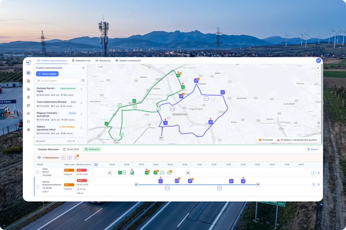
All right, so we got together again and decided that we needed a completely new design system and light, friendly and professional user interface.
Technology Strategy: PrimeVue Aura + Tailwind + Figma Make + Figma Design
In this project, we used the PrimeVue library with the Aura theme and the Lucide icon set. This decision allowed us to significantly reduce development time through the use of ready-made, tested components. The components were designed in accordance with accessibility standards, which eliminates basic errors. Modularity: we treated the library as a set of ready-made elements from which we build the final solution. Rapid prototyping and deployment were our priorities.
Parameters specific to our project overwrites Aura theme :
- typography (size scale),
- family font,
- spacing,
- rounding,
- colors
This allowed us to focus on the user experience, since many time-consuming issues were resolved for us.
Process on paper:
Phase 0: Use Figma Design and Make to create a design system and prototypes, and test the user flow.
User interviews: Identify the main user pain points and concerns.
Phase 1: Rapid iterations and bug fixes.
We replace the current components with components from the PrimeVue library. The goal was to quickly demonstrate results and eliminate UX and accessibility issues all at once.
Phase 2: UX optimization.
Implementing potential improvements to the user flow and optimizing features based on collected feedback.
Phase 3: Redesigning the optimization schedule, as this was a key feature and the place where users spent the most time. It was designed last because it was the most complex view, so I needed the most time to design it, and the team – to implement it.
Main user painpoints:
- Lack of clear system feedback and unintuitive workflows (UX Dead Ends). At key moments, the user faces a lack of transparency—from hidden limitations (e.g., the need to manually switch the view to 1,000 records to perform a bulk action), unlabeled icons, uncertainty about whether the system has saved the state or whether it’s safe to exit the view. On top of that, errors—crashes—that disrupt the workflow.
- Data friction and cumbersome back-and-forth between systems (Excel vs. the application): Poor support for “dirty data” and geocoding forces users to constantly switch between the system and external tools (Excel, Google Maps). Manually searching for ZIP codes, correcting headers in CSV files, and the lack of system prompts for unrecognized locations create unnecessary frustration.
- The algorithm’s “black box” nature and lack of control over optimization: Automatic route planning often operates in a way that is incomprehensible to the user (e.g., connecting absurdly distant locations or skipping stops “along the way”). The lack of insight into the algorithm’s logic leads to a decline in trust in the system’s recommendations, forcing the operator to artificially “trick” the algorithm (manually changing times, adding additional restrictions).
Solution
- To address the issue of unclear statuses and gaps in feedback (UX Dead Ends):
We introduced clear system statuses, progress messages (e.g., during import/export), and clear labels for icons. Instead of hidden restrictions (such as manually changing list views), we simplified bulk actions into intuitive toggles directly within the interface.
- Regarding the issue of data friction and jumping back and forth to Excel:
We built data validation and hint mechanisms directly into the application, which reduced the need to manually correct CSV files or search for coordinates and ZIP codes externally in Google Maps.
- We increased the transparency of the system’s recommendations (so-called “explainable logic”). We added a clearer overview of driver workloads and a visualization of constraints, giving users quick, intuitive tools to adjust routes without having to “trick” the algorithm.
I don’t recall the handoff process ever going so smoothly and easily. I prepared all the screens in Figma Design and shared them via MCP. After the project was implemented, we ran tests, and I provided the developers with feedback on spacing, typography, and design consistency.
It took us a little longer, but the end result was very satisfying. I really appreciate the time we spent analyzing the problem, because those few workshops saved us from making a huge and costly mistake – attempting a month-long patch on legacy UI components that would have consumed our timeline without solving root usability issues or achieving legal EAA compliance.