The application I was asked to redesign is a car navigation for mobile devices – Naviexpert
Current situation
- A strong representation of hardcore users who have been using the app for years
- Very mature interface
- Declining rate of new users
- Interface somewhat outdated
Diagnosis
- New standards on the market with similar applications
- Many advanced functionalities with minimal practical usage
Objectives
- Attract new users
- Keep our user base
- Revamp the design
Steps
- Analyse data to detect rarely used features
- Select most important features
- User testing
- Transition to the new technology as painlessly as possible, without neglecting the development of the application and the needs of the B2B customers.
Challenges
One of the primary challenges for long-standing mature products is to maintain consistent visual identity.With the continuous addition of new features, the product keeps evolving, becoming overly complex and harder to navigate. Ultimately, the application as it stands no longer supports optimal user interaction, prompting a redesign.
Data analysis
The initial step involved analyzing data and usage statistics. While we had a clear understanding of the core features in our product, there was some uncertainty around very specific and advanced options. Investing in features with minimal user engagement seemed pointless. Conversely, we identified key functionalities that separated us from the competition, with the hope of creating a more coherent product.
Research design
Our main concern was to keep our regular, hardcore users happy. We knew that a large portion of our loyal user base relies heavily on the most advanced options. Their feedback was crucial to us, which is why we invited them to participate in our research. We also considered new users whose expectations are primed by major players on the market.
Methodology
- Usability testing
- RITE (Rapid Iterative Testing and Evaluation)
- Survey methods
- IDIs (in-depth interviews)
- Clickable hi-fi mock-ups
Design objectives
- Cater to the needs of users accustomed to products from major competitors
- Ensure redesigns maintain continuity for existing loyal users
- New UI should reflect our key differentiators
Respondents
- Regular users, 8 people
- 35-65+ years old
- Mostly men
- Core product users
New users
- 8 people, unfamiliar with the product
- 25-40+ years old
- Women and men
- Mainstream navigation users
Approach
- Stationary user testing
- Duration of the examination: approx. 1 hour
- Recorded session: camera + screen recording with sound
Results
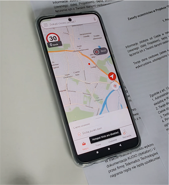
Speaking with our users made it clear that we need to proceed with caution. Preserving the features that make our product stand out is essential. In other words: evolution, not revolution. While respondents were generally happy with the new design, some long-time users expressed hesitation about the changes projected. By contrast, placed greater emphasis on speed and responsiveness.
Ultimately, the research proved critical in guiding our design choices. Starting development without this data would have been like trying to navigate a foggy forest with only a faint hope of getting anywhere.
User testing
Design
Design system, specification, flow and information architecture.
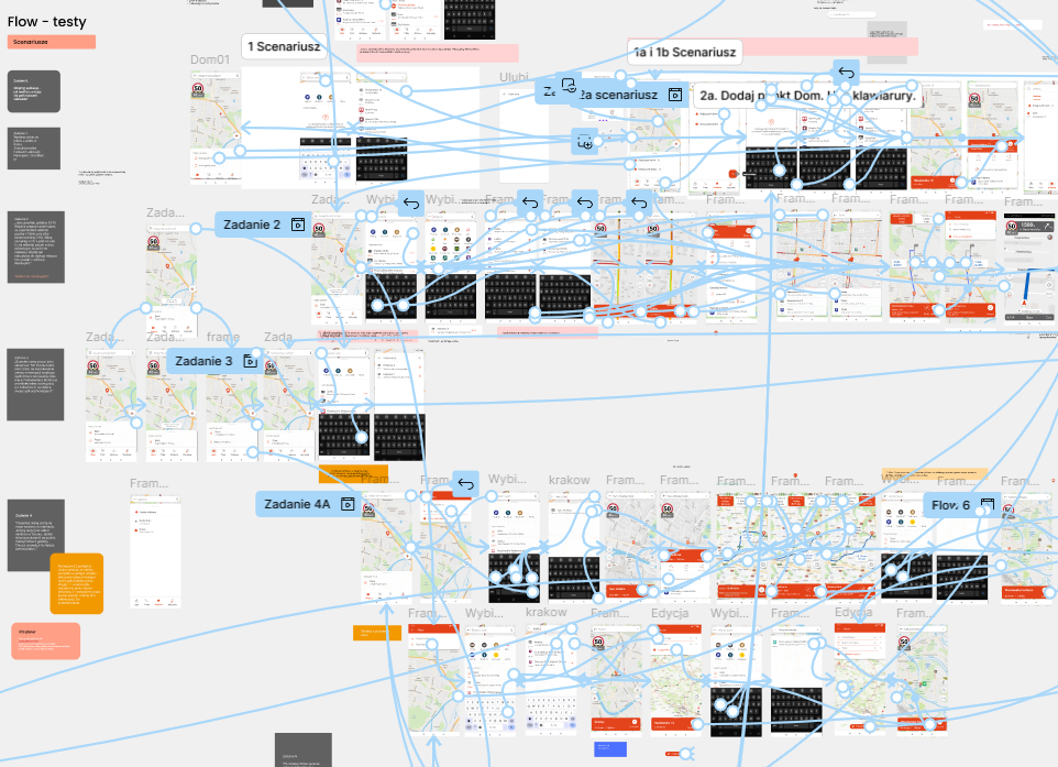
With the data in hand, we moved on to the next phase. While the main objectives were already clear, we still faced thousands of minor inconsistencies, flow issues, and edge cases that needed to be addressed.
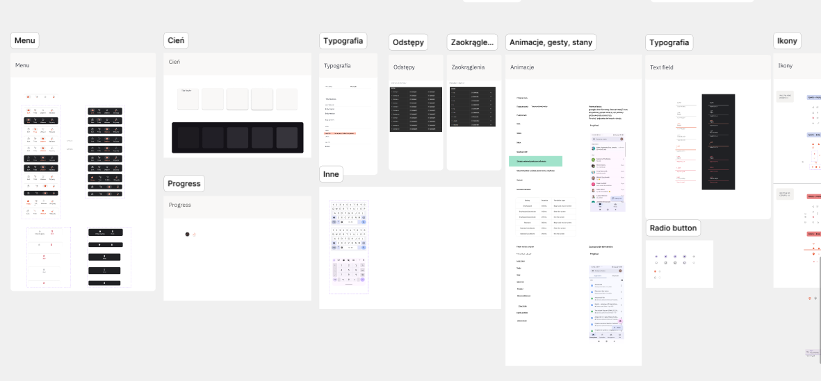
An entire design system was developed, including
- typographic principles
- colours
- components
- icons
- micro-animations
- flows
- text fields with all states (inactive, active, validation)
- buttons
- night and day mode
- vertical and horizontal view
- extremely small screens, non-standard font size settings
- reference resolutions
Design, iterations is always a long process, sometimes messy too
We also meticulously documented everything in Confluence, complete with links to Figma mock-ups. Eventually, we transitioned fully to Figma, using the specifications embedded in individual Jira tasks as our single source of truth.
Every element had to be precisely measured and clearly described to minimize ambiguity during handoff. Still, despite our best efforts, uncertainties and unforeseen scenarios inevitably arose. We worked back and forth with the development team, continually revisiting preestablished paths and refining them through further consultation.
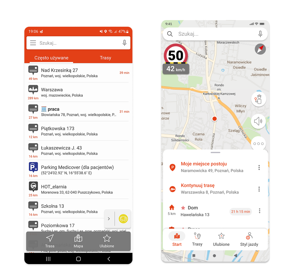
Our main goal was to introduce the map view as the main screen.
Internal tests
The first recipients were our own employees, who provided detailed and valuable feedback. We immediately added some of their suggestions to the backlog as actionable tasks, while deciding to leave out others.
Beta testing
Following the above, we moved into the beta testing phase, sharing a test version with our beta users and inviting their feedback. The responses received were both insightful and encouraging, with several users even offering their own ideas and solutions, which proved especially valuable.
Next steps
Our next step was to survey a broader spectrum of our users for their impressions of the changes. This is one of the most critical phases in the entire process, as it helps us identify the elements that still need attention and prioritization, while also determining those to be addressed later. The survey results were positive: users expressed overall satisfaction, and we were able to collect targeted feedback on areas where we had lingering doubts
A (very) small part of our design system
To sum up
Redesign is a long and complex process that involves balancing many factors—and there’s always a risk it won’t be well received. Fortunately, that wasn’t the case here. In my view, the most important factors throughout the process included:
- Clear goals and product vision
- Thoughtful prioritization. We can’t build everything, but we can excel in the key features/where it matters most.
- Data-driven design. It may seem obvious, but it’s critical to understand both the strengths and weaknesses of the product.
- Effective communication. Get the developers and testers involved early into the design process.
- Robust design system to ensure seamless handovers.
- Thorough testing and iterations. From major features down to the smallest details, test everything appropriately based on context and budget.
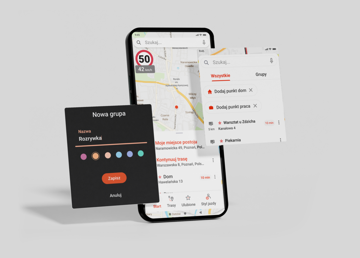
A new screens


